Reducing churn from growing businesses and decreasing month-end close times

This project originally shipped in 2025. The visuals shown above reflect a later visual refresh I explored independently to push the interface further than the product direction allowed at the time. Screens from the production experience are included throughout the case study.
Context
How do we reduce churn from our larger customers?
Ceterus is a fintech startup that provides bookkeeping and tax services for Small Businesses and Franchises. They offer automated bookkeeping and advanced reporting through an online portal. Ceterus primarily supports franchise business owners with 2-10 locations, but as customers grew past 10 locations, churn increased. Our systems didn’t scale well, and growing clients struggled with slow or inaccurate bookkeeping and confusing workflows.
Impact
Increased customer capacity
Increased customer engagement
Decreased time to close books
Decrease in monthly churn
100% reduction in cost, with the company no longer requiring Zendesk
My Role
I served as product designer for this project. All screens here are my original designs. Visual design is a combination of my own and our react library, Ant Design.
The direct development team included ~5 engineers and a product manager. Work was organized in an Agile framework with three-week sprints. Strategy was coordinated by the product team and an investor, to which I presented to regularly and served as product attaché. This project was completed simultaneously with a custom support ticketing system.
Discovery
The most common reasons for churn that Ceterus experiences are related to the speed at which a company’s books are closed or the accuracy of those books. After losing several larger customers, the product team prioritized interviews with customers who own a higher number of locations and recently churned customers.
In addition to qualitative interviews, I analyzed product session data for higher-location customers using our analytics tool. This helped identify behavioral patterns, engagement gaps, and friction points in critical workflows.
Features
Bringing clarity to required customer actions
Business critical tasks were not only split across multiple pages, but users lacked clear context around what actions were required to close their books. Customers often relied on external tools such as spreadsheets to track and prioritize tasks for individual locations. Without a clear system inside the product, users risked submitting incomplete information, which could delay closing books across all locations. These challenges only worsened as the number of locations increased.
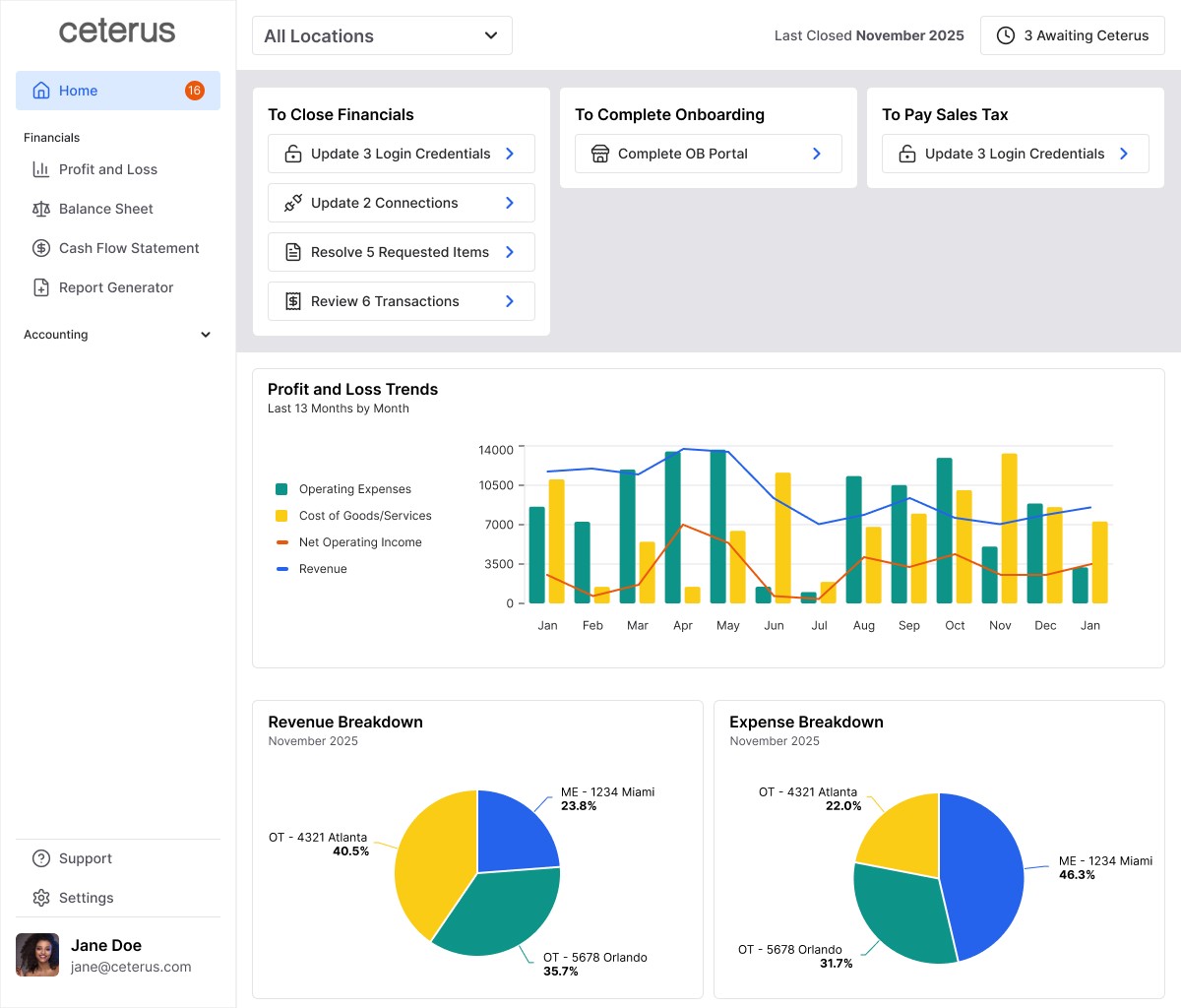
I proposed consolidating the two pages into a single unified experience, since they represented two parts of the same workflow. I designed a new home page that could house both of these parts of the process, allowing users to complete all required actions in one place. Tasks were grouped by what they accomplish, enabling users to prioritize based on business impact or speed of completion. A location filter further improved prioritization by allowing customers to focus on specific locations instead of managing everything at once.

Streamlining business critical customer input
From prior interviews, I was already aware of friction in the transaction categorization workflow, managed on a page called Transactions to Code. Beyond lacking context, the interface was bloated and difficult to navigate. Transactions were displayed as single-line table rows requiring users to categorize, add details, and leave comments within the same row, which extended beyond the screen width. The comment workflow within it was unintuitive and often led to important clarifying comments never being submitted.
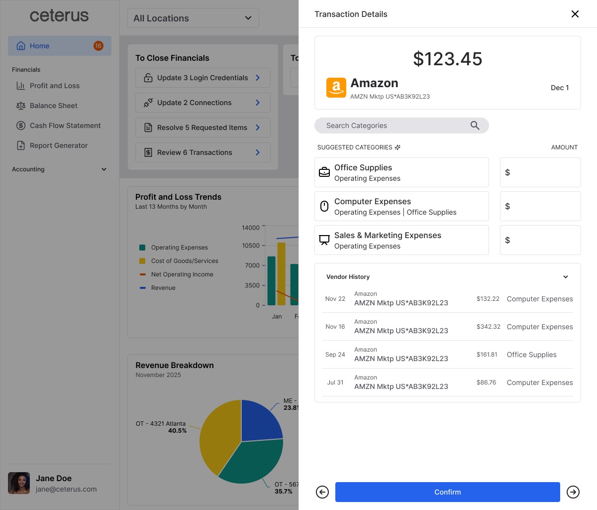
While the introduction of the home page addressed contextual gaps, the categorization experience still required significant improvement. I redesigned the workflow using a drawer that opened detailed transaction information without navigating away from the main page. This provided more space to establish a clear visual hierarchy and guide users step-by-step.
I also simplified the copy into plain language to make the process more accessible to our less accounting savvy users. At the same time, I advocated for flexibility for power users through a feature called Accountant Mode. By default, the Chart of Accounts was grouped into guided categories to support less experienced users. When Accountant Mode was enabled, those groupings were removed, allowing experienced users to quickly navigate directly to specific accounts.


Boosting engagement for higher location customers
When analyzing our session data, I noticed a trend that customers who regularly used analytics and reporting tools logged in more frequently and stayed more current on required action items. However, many larger-location customers were not using these features, leading to fewer logins and a buildup of unresolved tasks.
To increase engagement, I focused on two improvements. First, I introduced more flexible reporting filters. Previously, users could only view data for a single location or all locations combined. For customers managing many locations, viewing everything at once was often too broad to be actionable. I introduced the ability to view subsets of locations, enabling more meaningful analysis.
Second, I surfaced high-value data points through clearer data visualization. By identifying which metrics active users relied on most, I prioritized those insights and made them easier to digest. The goal was to increase the perceived value of logging in, encourage more frequent engagement, and indirectly drive better completion of required bookkeeping tasks.

Design System + Component Library

Process
Though this case study largely focuses on the Homepage this was a large project that reshaped the way Ceterus conducted business as a whole. There were 2 major points of focus:
Externally, we will provide a more intuitive experience for categorizing transactions and displaying to customers what is required of them to close their books on a more granular level.
Internally, we will change the way Ceterus closes books and allow customers more control over their financials. A new support ticketing system will be implemented to support the external needs.
Discovery + Research
Due to recently experiencing some churn from larger customers, the product team and I focused more on interviews with customers who own a higher number of locations and some recently churned customers.
These interviews led to a few key findings:
Users were lacking key details about the information that was required of them to close their books
Larger users were quickly becoming overwhelmed by the amount of action required from them
Larger users were struggling to parse through the financial details of their numerous locations
Communications within the application were clunky and unintuitive
The existing pages responsible for the customer's input were far from perfect, but the issues were exponentially more troublesome the more locations a user managed.


These items that require customer input and block critical business functions would come to be dubbed as blockers, of which there are 2 types: Transaction and Non-Transaction. Currently, Transaction Blockers lived on the Transactions to Code page and Non-Transaction Blockers lived on the Action Center. I had previously noted some issues found within Transactions to Code, specifically the functionality of comments and the flow for submitting transactions, but there was another looming issue. There are 2 pages being used to complete 1 action and they are both handled in completely different ways. Completing all of the blockers on one page may not close the books for a single location.
The Action Center at this time did not do the user many favors in helping to prioritize their actions. Just a few observations from the screenshot below, there's no indication of how old these blockers are or how up to date a company's financials are from this view, so there's no way to know if these items are even really required to close the books, or if a user is 4 months behind because of them. To figure out the related location each item would have to hovered individually, and that doesn't even address the 120 stacked transactions that need to be coded . Those which can't even be tackled on this page and would link to the other page.
So I propose we combine the pages at least. Seems simple enough. Actually, due to the way we pull Zendesk tickets into the Action Center, they can’t exist with another type of item, like transactions. This is why in the previous Action Center there was simply a link to all the transactions a user has to code that takes them to the Transactions To Code page. That is another reason why there are internal and external focus points. We will have to create another way to handle these Blockers internally so that we can display them together externally. That project, which would end up being our own custom support ticketing system called Blockers, could be a case study on its own, but keep in mind both of these are happening simultaneously.

The original Action Center that could only link to the Transactions to Code page.
Now that we’ve figured out how we’re going to get these blockers to coexist, let’s figure out how to display them. In early conversations with leadership, I proposed we introduce a new home page rather than simply add on to the current Action Center. On a new home page these blockers can be more clearly contextualized and with drawer functionality, users will never have to be pushed to another page.
Early iterations of the home page explored different ways to break up the blockers and show the closing status for user locations. Separating by month, location, and blocker type were all important, but it was crucial that it be done in a natural way for accounting processes. Because of the importance of these blockers, Leadership wanted them to really dominate the space and demand attention from users. It was my job to balance this request while also avoiding notification fatigue for our users.

Early Homepage draft (Old UI) featuring first Financial Insights concept.
From a business perspective this may seem like enough and these new features will surely increase the usability of the page, but something still felt missing. We're optimizing customer input, but this is essentially still just more work for the customers. Customers are paying us to get their books done and our big update is essentially just a way for them to help us more? I do believe the current user flow is slowing the process down, but from the analytics I believed this issue to be more of an engagement problem than a process problem. I want to incentivize this work and provide something to users outside of what they are already paying us for and expecting from us.
This is where financial insights come in. Financial insights will bring a new layer to our customer-facing application that not only incentivizes more frequent visits, but can also help inform the business decisions of customers. This would also present a marketing opportunity as this would create a new face for the application. A clearer separation from the Ceterus of old.
During this time I was also asked to reimagine what our application, called "Edge" at the time, could look like in a complete redesign. I knew this possibility was highly unlikely, but it allowed me to toy with possible new components.
Design

When creating a new look for some of our most frequently visited pages, one of my key focuses was establishing a visual hierarchy for their content. Prior versions struggled with a lack of clear paths due to poor sizing and grouping of elements leaving customers with a rough path to key actions. I aimed to reduce the cognitive load of users by making it clear which actions were required and presenting them in a way that could be easily understood regardless of a user's prior accounting knowledge.
I also aimed to restructure the sitemap and personalize the application more. By recategorizing pages I intended to speed up key navigations and better set expectations for what pages could accomplish. On top of that, I hoped to include settings that allowed users more control over what type of financials they would be greeted with.
A lot of changes are being made, but blockers, specifically transaction blockers, are still at the forefront of the project. I want to introduce a new solution for this to stakeholders early and often for validation. Over the next 2 weeks I would iterate on different low fidelity transaction prototypes with leadership and development to discover a simple way to handle complex transactions.
In early discussions with leadership there was a focus on 2-line transactions, transactions which a user would only be able to edit 1 line of the transaction. This type of transaction is the most common we deal with and would start to be referred to as a 99%er. The 99%er will be essential to really nailing this transaction editing feature.

Early 99%er Screen After Development Revealed a Multi-Layer Drawer Would Be Required
Simplicity was key when it came to designing the 99%er view. I wanted to make it clear not only where the transaction came from and what it was, but also where it needs to go. It was important to me that the UI be very straightforward because the natural complexity of a chart of accounts and how many locations a transaction can land in will always require a certain level of effort. Decisions about how to navigate that would need further validation.
The other type of transaction, those with 3 or more lines, would be referred to as multiple line transactions. Early on in development it was discovered that we would not be able to let customers directly edit multiple line transactions. Customers would have to provide a comment to us on these transactions and we would continue handling the edit ourselves. Or so we thought.
Development did ultimately figure out a way to handle both types of transactions, but it came at a cost. The UI would have to handle both types of transactions with the same UI components. Naturally, multiple line transactions include much more information and require more fields so this could lose a lot of the simplicity of the 99%er design and potentially create friction for our users with less accounting knowledge. The UI for coding 99%ers had already begun to bloat from prior development restraints and this threatened to do even more damage.

Early Proposed UI for a 99%er.

Multiline Transaction UI with a 99%er.
I pleaded with other members of the product team and development, but we were already working within a tight timeline and maintaining a separate UI wasn't believed to be feasible. However once given the opportunity to validate the designs, there was a strong push back from users about the newer version. I believed this was a case where sacrificing the overall experience for most in favor of edge cases did not make sense and users agreed. Regardless of some additional development time, this was the experience we needed to be aiming for. This feature would no longer ship without the unique 99%er view.

Initial Launch Version of the 99%er View.
With transaction coding figured out, I continued working on the other redesigns. Scope had officially removed an entire application redesign from the table, but we still pushed forward with the Homepage, Blockers, and hopefully financial statements. The hope was that since the bulk of our users focus on those features, it could still feel like a new application even if those were the only changes made.
Non-transaction blockers were fairly straight forward, externally at least. Most requests fell within a few categories: Information collecting, external integrations, or text entry. So even if there were technically 50+ blockers we needed to account for, we only needed a few UI choices to cover all those bases. And some of those choices, such as external integrations, were simply buttons (lucky me). Text entry blockers did get a few iterations, however they were limited due to the functionality of the drawer itself.
When designing the non-transaction blockers I focused on maintaining context for each item. I wanted users to remain aware of what action was needed, for what process, for what month, and what location, without having to navigate around. A much different experience from the prior action center which only displayed what action was needed. This was to improve the ability of users to prioritize certain actions for their own desired results.

Early Iteration Blocker drawer for restoring a connection.

Blocker drawer for updating a credential.
One of the big points of conflict during this project was the functionality of the drawer, and more specifically the submit button. I was always pushing for a 1 click solution; no matter how many changes were made within the drawer itself, you hit submit, and all of those are submitted at once. The issue was that things like text entry and form submissions, or even transactions, all seemed to require different layers of submission. Developers pushed back on this, arguing to keep the code as simple and clean as possible. This would require users to individually save/submit each change and manually close the drawer. So if a user adds a comments and completes a form they would have to save both of those actions independently and then manually close the drawer. This time leadership stepped in without the need for more external validation, possibly due to the timeline. Despite the calls for simpler code, the users needed a simpler experience. That was a tradeoff we did not want to sacrifice.

Final Mockup Blocker drawer for information requests.
At some point in all that conversation, financial statement redesign had also been removed from the scope, so focus returned to the Homepage UI. Now that we had more information about the possibilities of this new page and a clearer timeline, I stripped down the UI and focused purely on the experience and workflows for users. I confirmed approval for that before returning to the UI design. This was the home stretch, this is also when things got complicated again.
We had to find alignment on the UI from leadership, the product team, and other members of the company. The product team preferred a clean, clear view more akin to a modern application. Other members gravitated towards the vibrant, blocky UI that was created during early iterations. My challenge would be to balance the both of those.


2 of the many UI options that were presented to various stakeholders.
As conversations continued, I was able to narrow the gap between preferences and find a happy medium. That would allow me to continue work on the financial insights, which would have a large impact on the overall look of the home page.
When I was originally planning insights, I made sure I only pulled numbers from places I had already seen so that I knew they were possible. Commonly viewed features that were simply being pulled to the front of the application for easier access. I also tried to pull in less common, helpful features, but there wasn't much trust in the accuracy of some of these. Even when thinking about the presentation, I only used types present in our library, Highcharts. Even with those considerations, it pretty quickly became more of a question of what could we show versus what we wanted to show. With the combined effort of the product team, our engineers, and accountants we decided on what charts would be the first on the page, and then we could build upon those later.
What we decided on was a combination of different charts dependent on if you were viewing multiple locations or a single location. This would be determined by your location selection at the top of the home page, same as your blockers.

Early Homepage Iteration in a Testing Environment.
Conclusion
After a period of UAT, we began to slowly roll out the new update over the period of a few weeks, starting with beta testers. We also had to account for the time to migrate our Zendesk tickets to our new blockers feature. The improvements were noticed almost immediately and users were very active in their usage of the new features like transaction editing. The categorization of blockers led to a more steady input as users now knew what items were specifically blocking them and could prioritize to their needs.
After the full release, we were able to continue to quickly iterate and continue with more features to empower our users such as transaction splitting, a commonly requested feature.
Revisiting the Interface
After the product launched, I revisited the interface to explore how the Home could evolve with fewer constraints. This refresh was creating independently while updating this portfolio and reflects how I would approach this project today with a stronger focus on hierarchy, current technologies, and responsiveness.
During the original project, product timelines and broader platform priorities limited how far the visual system could evolve. The focus as on delivering functional improvements quickly, which meant some system-level opportunities were deferred.
I focused the refresh on areas where the original experience had the most opportunity for improvement.
Stronger Visual Hierarchy
The refreshed layout creates a better balance between business metrics and the actions customers need to take. Financial insights remain prominent, but blockers are more clearly organized, helping users understand both the state of the business and what requires attention.
This approach reduces visual competition between elements and allows users to move more naturally between monitoring performance and taking action.
Modernized Component System
The refresh uses a new component library that introduces more consistent patterns for tables, cards, and controls. Beyond a more contemporary visual style, the updated system improves responsiveness and creates a stronger foundation for scaling the product across different screen sizes.
This also simplifies interaction patterns and creates a more predictable experience across the platform.
Responsive and Mobile Experience
The original product focused primarily on desktop workflows. In the refresh, I explored how key operational tasks could translate to a mobile experience.
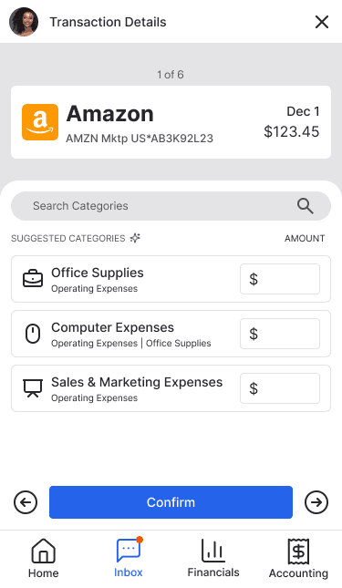
This included adapting navigation patterns, and action flows so users could review and manage tasks from smaller screens without losing context.
Expanded Data Visualization
Some data visualization concepts explored during the original project were ultimately cut due to development constraints. In the refresh, I revisited those ideas to better highlight trends within financial data.
These visualizations help users quickly identify changes in revenue, expenses, and operating performance without relying solely on tabular data.
AI-Assisted Transaction Categorization
Categorizing transactions is one of the most repetitive tasks for small business owners. In the original experience, users needed to review each transaction and manually select an account from a long dropdown list.
In the refresh, I explored introducing AI-assisted categorization. Incoming transactions are analyzed and the system suggests likely expense categories based on transaction data. Users can quickly confirm the suggestion or choose a different account if needed.
This approach reduces the cognitive load of scanning long account lists while still preserving manual control when the suggestion is incorrect.


