
Ceterus Home
Role
Product Designer
Collaborators
Investor
Director of Product
Product Manager
Director of Engineering
Tools
Figma
Heap
Claude Code
Ceterus provides automated bookkeeping and tax services for small businesses and franchises through an online portal with advanced reporting. The company primarily supported franchise owners with 2 to 10 locations, but churn increased as customers grew beyond 10. Our systems did not scale well, and larger clients struggled with slow or inaccurate bookkeeping and confusing workflows.
I led the design work from research and problem framing through final design. This work was completed alongside the design of a custom support ticketing system.
Note: This case study is based on a real shipped project. The interface shown throughout reflects a later redesign, not the exact UI that went into production.
Challenge
Larger customers were quickly becoming overwhelmed by the volume of action required across locations
Communication inside the application was clunky and unintuitive leading to missed and undelivered messages
Features
Bringing clarity to required customer actions
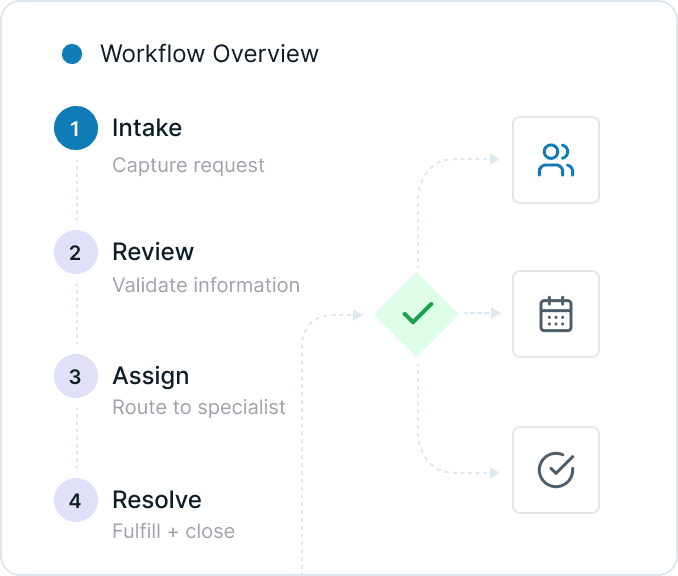
Business-critical tasks were not only split across multiple pages, but users lacked clear context around what was required to close their books. Customers often relied on external tools like spreadsheets to track and prioritize tasks for individual locations. Without a clear system inside the product, they risked submitting incomplete information, which could delay closing books across all locations. These challenges only worsened as the number of locations increased.
I proposed consolidating those pages into a single unified experience, since they represented two parts of the same workflow. I designed a new home page that brought both parts of the process into one place, allowing users to complete required actions without moving between screens. Tasks were grouped by what they accomplish, helping users prioritize based on business impact or speed of completion. A location filter further improved that prioritization by allowing customers to focus on specific locations instead of managing everything at once.
Streamlining business-critical customer input
Prior interviews had already surfaced major friction in the transaction categorization workflow, which lived on a page called Transactions to Code. Beyond missing context, the interface was bloated and difficult to navigate. Transactions were displayed as single-line table rows that required users to categorize, add details, and leave comments all in the same row, which extended beyond the screen width. The comment workflow was especially unintuitive, which often led to important clarifying details never being submitted.
While the home page addressed broader contextual gaps, the categorization experience still required significant improvement. I redesigned the workflow around a drawer that opened detailed transaction information without taking users away from the main page. This provided more space for a clear visual hierarchy and allowed the process to guide users step by step.
I also simplified the copy into plain language to make the process more accessible for users with less accounting experience. At the same time, I advocated for flexibility for power users through a feature called Accountant Mode. By default, the Chart of Accounts was grouped into guided categories to support less experienced users. When Accountant Mode was enabled, those groupings were removed, allowing experienced users to navigate directly to specific accounts.
Boosting engagement for higher location customers
When analyzing session data, I noticed that customers who regularly used analytics and reporting tools logged in more frequently and stayed more current on required action items. Many higher-location customers, however, were not using those features, which led to fewer logins and a buildup of unresolved tasks.
To increase engagement, I focused on two improvements. First, I introduced more flexible reporting filters. Previously, users could only view data for a single location or all locations combined. For customers managing many locations, viewing everything at once was often too broad to be useful. I added the ability to view subsets of locations, enabling more actionable analysis.
Second, I surfaced high-value data points through clearer data visualization. By identifying which metrics active users relied on most, I prioritized those insights and made them easier to digest. The goal was to increase the value of logging in, encourage more frequent engagement, and indirectly drive better completion of required bookkeeping tasks.
Conclusion
Problem
Lack of information about what processes were being blocked, left users unsure about what actions to prioritize
Solution
Clearly labeled and categorized action items help users handle tasks efficiently and provide us information early in the accounting cycle

Impact
20-30
%
Reduction in close timelines
15-20
%
Reduction in support ticket volume.
The impact was noticeable quickly. Users were highly engaged with features like transaction editing, and the clearer categorization of blockers contributed to a decreased time to closing books.
More importantly, the project created a clearer and more scalable foundation for supporting larger customers. It gave users more control, improved the visibility of critical workflows, and established a stronger product direction moving forward.
Ceterus Assembly
Ceterus provides automated bookkeeping and tax services for small businesses and franchises through an online portal with advanced reporting. Ticket resolution times were slow, customer information was fragmented and led to poor handoffs, customers were churning before they could even be onboarded, and recent internal tools had poor adoption. I was brought in to address these core operational issues and to streamline these decaying processes.
Case studies for individual projects available upon request
Role
Product Designer
Collaborators
Director of Product
Product Manager
Director of Engineering
Tools
Figma
Heap
Challenge
Problem
Fragmented information forced users to constantly switch between multiple applications to piece together a single customer's status
Solution
Providing critical data into a single touchpoint allows users to prepare for tickets faster and have fewer breakdowns during handoffs
Features
Building the backbone for our internal teams
Customer information was fragmented across more than five tools and products, spanning both internal systems and third-party platforms. Customer-facing teams had to constantly switch between applications to piece together a single customer's status. This reliance on disconnected tools led to inconsistent handoffs, duplicated effort, and slow ticket resolution.
To address this, I introduced Support Console, a foundational feature designed to serve as a central hub for customer information. It consolidated the most critical data from internal tools and external systems into a single touchpoint, while still providing quick access to less frequently used details. Early prototypes tested with the support team confirmed that this feature alone would lead to faster ticket preparation and fewer breakdowns during handoffs.
Optimizing our support ticket system for scale
After shipping several internal features that reduced support response times and improved integration uptime, a new issue surfaced on the customer side. We received significant feedback from our customers managing large numbers of locations that they were being overwhelmed by the volume and frequency of requests coming from our team. While many of the requests were necessary to keep our accounting processes and integrations unblocked, the way they were presented created unnecessary friction and slowed overall progress. Addressing this required changes to the customer-facing application, supported by new internal features.
Through my own analysis and customer feedback, I learned customers lacked clear actionable context around what was required of them and how each request related to their accounting processes. To address this, I designed a custom support ticketing system called Blockers. Internally, Blockers functions as a full-featured ticketing system comparable to Zendesk, but is natively integrated into our internal tools. Externally, it presents customers' action items in process-targeted segments. This reduces cognitive load for customers, helps them prioritize their responses, and ultimately improved turnaround times without increasing support overhead.

Stabilizing our internal source of truth
While reviewing onboarding and support tickets that were progressing slowly, we identified a lack of consistency regarding who was responsible for customers and their locations. Some relationships between customers and internal users existed to begin the onboarding process, but the majority of customers and location data was managed in Salesforce and Excel spreadsheets. These sources were slow to update and easily mismanaged, especially as employees changed roles or locations were transferred.
To prevent customer processes being lost, I designed a tool to manage these relationships within our own system, with support for bulk reassigning. I partnered with the engineering director in a whiteboarding session to explore different ways to tackle this feature. The final design is built around 2 sections: a customer table and a tabbed sidebar of internal user cards. Selecting a card will filter the table to show their associated customers, enabling teams to quickly reassign large groups of accounts in response to workload shifts or employee turnover. This same UI would then later be used to create a tool for assigning specific locations to internal users.
Impact
100
%
Cost reduction — Zendesk no longer required
Due to the range of features introduced, the impact stretched across the business. The Support Console and Blockers became the highest adopted internal tools and contributed to a noticeable reduction in ticket resolution times.
New York Public Library
The New York Public Library is the second largest library system in the United States. Its mobile app allows users to browse and borrow from its collection, view and register for events, and access a selection of digital resources.
Role
Product Designer
Tools
Figma
Codex


Challenge
Problem
Lack of cohesion between features within the application forced users to move through multiple screens to complete simple actions.
Solution
An intuitive, workflow-driven experience supports key user needs and also encourages deeper exploration of the library's offerings.
The New York Public Library mobile app offers a wide range of features, but lacks clear prioritization of core user workflows. The experience feels more like a collection of features than a cohesive product, making common tasks harder to complete than they should be.
As a frequent user, I often found myself moving through multiple screens to complete simple actions, or defaulting to the website instead. This highlighted an opportunity to create a more intuitive, workflow-driven experience that not only supports key user needs like borrowing and managing media, but also encourages deeper exploration of everything the library has to offer.


Approach
I began by mapping a simplified information architecture and defining the core workflows for the app. From there, I designed an initial homepage and outlined a lightweight product requirements document to clarify scope and direction.
The redesign centers on media borrowing as the primary workflow, with supporting improvements to renewal, discovery, and saving items for later. I also introduced functionality that was available on the web, but missing from the app, such as the ability to save media for future access. At the same time, I left out ideas that depended on structural changes to the library’s current data model, such as directly linking from blog content to catalog entries.
After generating initial concepts in Figma, I refined the designs through multiple iterations and built a coded prototype to validate interactions and feasibility, using Codex to help manage complexity and move through development more quickly.

What Changed
The existing app greeted users with links to features, but did little to prioritize what most people were there to do. In the redesign, the homepage shifts from a directory-style entry point to a workflow-driven one, bringing the most important actions to the surface and making the experience feel more personal and immediately useful.
Checkouts, holds, and saved media are now accessible from the main page rather than buried behind multiple layers of navigation. Because borrowing and managing media are the core services most users associate with the library, I treated them as the primary workflow and made them easier to access and manage.
Saved media is newly introduced to the mobile experience, bringing in functionality that was previously available on the web but missing from the app. Saving items creates a simpler way to keep track of books and makes it easier for users to return to titles they are considering before requesting them.
I also improved the visibility of actions tied to borrowed and saved media. Requesting, holding, and canceling actions are now presented more clearly based on the context in which an item is being viewed, reducing confusion and helping prevent dead-end actions, like attempting to request a book that is already checked out.
Discovery was also expanded beyond just searching. In the current app, users are expected to know what they are looking for before they can find anything. The redesign introduces more opportunities to surface recommendations and NYPL editorial content, making it easier for users to explore books through themes like “Women Who Shaped NYC,” rather than only through direct search.


Decisions + Trade-Offs
Because this was an exploratory redesign, I focused on changes that could make a real impact without depending on an overhaul of the library’s existing systems. I chose to center borrowing and media management because they are the most immediate tasks for many users and the clearest place to improve usability. At the same time, I wanted the app to support more open-ended exploration, not just direct search, which led me to surface recommendations and editorial content in ways that encourage browsing. Some ideas depended on a deeper level of catalog integration than the current system could support, so I left those out rather than force solutions that felt unrealistic.
Conclusion
This redesign was centered on the simple product goal of making the app more useful from the moment a user opens it. That meant prioritizing the workflows people return to most, reducing unnecessary steps, and creating more room for discovery without losing sight of the constraints of the existing system.
About Kellen
For as long as I can remember, I’ve been obsessed with creative expression through movies, television, video games, music, art, and design. Not just to consume, but to analyze and understand why they work.
That habit of observation and attention to detail naturally led me to design. I'm drawn to understanding how things are structured, where they break down, and what makes an experience truly enjoyable. That curiosity has shaped how I approach product design. I'm always looking for the simplest path through complexity, trying to surface what matters and make the experience feel effortless.
I’m originally from the South, born in South Carolina and raised in Georgia, but now I call New York home. Outside of work, you can find me trying new restaurants, gaming, or keeping up with my growing collection of houseplants.

DESIGN PHILOSOPHY
Design for Impact
I want the products I work on to feel clear, considered, and useful, and to look good doing it. My visual design background helps me bring structure to complexity without losing the details that make them feel thoughtful.
Experience
Ceterus
Product Designer
Focused on customer-facing and internal tools for a B2B accounting platform, focused on simplifying operational complexity, improving support workflows, and helping the product scale with larger customers.
Legislative Services Agency
Web/Interactive Designer
Worked on enterprise and public-facing tools that made legislative information easier to access across desktop, tablet, and mobile, including internal systems and native mobile apps.
Freelance
Design Consultant
What started as helping my dad with visuals for his employer’s Christmas party in high school has grown into freelance work that now includes UX projects for nonprofits and startups.
Garnet & Black Magazine
Staff Designer
Designed editorial layouts and page spreads for the university’s student magazine, building an early foundation in typography, hierarchy, and visual storytelling.
USTA South Carolina
Marketing and PR Intern
Created promotional and brand materials across print, digital, and event touchpoints to support statewide league marketing efforts.